The rise of innovative, interactive, data-driven dashboard tools has made creating effective dashboards – swift, simple, and accessible to today’s forward-thinking businesses.
There are certain dashboard design best practices you should follow to display your data in the best way, making it easy to analyze and actionable. A poorly designed dashboard could fail to convey useful information and insights and even make the data less comprehensible than it was originally.
Want to know what is Business Intelligence? Read here
Need idea on best Courses to do this Quarantine ? Read here
Table of Contents
What is a Dashboard?
At its simplest, a dashboard is a screen in your application that displays information. Normally, a dashboard provides the user a global overview, with access to the most important data, functions and controls. In reality, a dashboard often becomes a sort of homepage, especially for power users.
A BI dashboard — or business intelligence dashboard — is an information management tool that uses data visualization to display KPIs (key performance indicators) tracked by a business to assess various aspects of performance while generating actionable insights.
We call them dashboards because, just like in a car, they’re meant to show us critical, pertinent data at a glance. But how do we establish what’s relevant enough to show in a dashboard? Think about how it’s done in a car. The car’s dashboard is used to show the driver information relevant to the task of driving the car – speed, distance covered, engine revs, remaining fuel and warnings when something isn’t working properly.
We don’t expect a car dashboard to display information about the news, local places of interest or upcoming appointments because however interesting this information is, it’s not relevant.
Further read what Wikipedia has to say about Dashboards.
Top Business Intelligence Dashboard vendors
Major vendors of modern analytics and BI platforms — all of which include BI dashboards in their product lineups — include Tableau, Microsoft, Qlik, MicroStrategy, Sisense, Salesforce, SAS, SAP, Tibco and IBM. Some vendors — notably Tableau and Microsoft, with its Power BI platform — provide various levels of product licensing, including options in which users can get a view-only license that doesn’t include its own analytics capability, but relies on analytics applications from third parties.
What makes a good dashboard?
An effective data dashboard should be striking yet visually balanced, savvy yet straightforward, accessible, user-friendly, and tailored to your goals as well as your audience. All of the above dashboard design tips form a water-tight process that will help you produce visualizations that will enhance your data analysis efforts exponentially.
Every dashboard you create should exist for a focused user group with the specific aim of helping users tap into business decision-making processes and transform digital insights into positive strategic actions.
Information is only valuable when it is directly actionable. Based on this principle, it’s critical that the end-user can employ the information served up by a dashboard to enhance their personal goals, roles, and activities within the business.
By only using the best and most balanced dashboard design principles, you’ll ensure that everyone within your organization can identify key information with ease, which will accelerate the growth, development, and evolution of your business. That means a bigger audience, a greater reach, and more profits – the key ingredients of a successful business.
A good BI dashboard design is one that:
- Makes the complex simple: we have lots of information, lots of data that changes all the time and different analytical needs and questions. We want to take all this complexity and make it simple.
- Tells a clear story: we want to be able to connect data to its context in the business and to answer the viewer’s questions. This is where the visual layout of a dashboard plays a crucial role.
- Expresses the meaning of the data: the chosen data visualizations need to correctly represent the data and the information you want to extract from it.
- Reveals details as needed: we want each viewer to have access to the data they need — no less but also no more. Some users might need to be able to see a more granular view of the data — others could suffice with an overview.
Why Dashboards are Important ?
A well-designed business intelligence dashboard acts as a snapshot of the management, providing a high-level view of the business, department, or a specific process without entangling the user in a mesh of numbers and figures. By engaging the full power of visual perception, they communicate a dense collection of facts efficiently and with exceptional clarity.
- Visual presentation of performance measures
- Ability to identify and correct negative trends
- Measure efficiencies/inefficiencies
- Ability to generate detailed reports showing new trends
- Ability to make more informed decisions based on collected business intelligence
- Align strategies and organizational goals
- Saves time compared to running multiple reports
- Gain total visibility of all systems instantly
- Quick identification of data outliers and correlations
- Consolidated reporting into one location
- Available on mobile devices to quickly access metrics
Best Courses on Dashboard Development
Tibco Spotfire Development
Learn Tibco Spotfire. One of the best BI tools used Industry wide that is also a part of Gartner’s Magic Quadrant ! Click here for a complete course at the Cheapest price !
Visually Effective Excel Dashboards
What you’ll learn
- How to approach an Excel dashboard project from idea to delivery
- How to add interactivity to your Excel reports – No VBA required
- Impress management with reports that make the decision-making process faster
- Clever use of Excel core functionality for responsive spreadsheets
- Learn how to create a professional KPI dashboard from scratch
- Create impressive, non-standard Excel charts using smart techniques
- Build Pivot Table-based dashboards for easy interactivity
- Use powerful visual techniques so your content has more effect
Click here to Enroll on Discounted price
Power BI Master Class – Dashboards and Power BI Service
What you’ll learn
- Learn to use the EASIEST Business Intelligence tool to create INTERACTIVE Reports and Dashboards in Power BI
- Lifetime access to course materials and practice activities. 100% money back guarantee
- Students will be prepared for the visualization and Power BI Service module of the Microsoft Exam 70-778 Analyzing and Visualizing Data by Using Microsoft Power BI
- Load Dashboards and Reports into the Power BI Service and Configure the Power BI Service
- Learn to use FILTERS and SLICERS to ask the MEANINGFUL questions of your data
- Learn how to use different graph VISUALIZATIONS such as column, line, pie, combo, treemap, geographical and waterfall
- Learn to create POWERFUL tables and matrixes of reporting data
- Work with Power BI and Excel together – Learn to use Excel to analyze Power BI data
- Learn to use CUSTOM Visualizations and Themes in Power BI
Click here to Enroll at discounted price
Interactive Python Dashboards with Plotly and Dash
What you’ll learn
- Learn about Plotly to create plots like Bar Charts, Line Charts, Scatter Plots, Heat Maps, and more!
- Create Layouts with Plotly’s Dash library.
- Use Dash to create interactive components with Plotly.
- Learn how to connect multiple inputs and outputs with a dashboard.
- Update live interactive graphs with clicks, hover overs, and more.
- Connect the interactive dashboard to live updating data for streaming information.
- Learn how to secure your interactive dashboards with App Authorization.
- Deploy your interactive dashboards to the internet with services like Heroku.
Click here to enroll at Discounted Price
MicroStrategy for Business Intelligence
What you’ll learn
- Overview of Data warehousing and Dimensional Modeling
- Attributes,facts,hierarchies and transformations
- Metrics,Prompts,Search objects in MicroStrategy
- Consolidations & Custom Group in MicroStrategy
- Intelligent Cubes in MicroStrategy
- FreeformSQL Reports in MicroStrategy
- MicroStrategy Dossier Visualization
- MicroStrategy Dashboard Creation
- Filters and Report creation
Click here to enroll at Discounted price
The Business Intelligence Analyst Course 2020
What you’ll learn
- Become an expert in Statistics, SQL, Tableau, and problem solving
- Boost your resume with in-demand skills
- Gather, organize, analyze and visualize data
- Use data for improved business decision-making
- Present information in the form of metrics, KPIs, reports, and dashboards
- Perform quantitative and qualitative business analysis
- Analyze current and historical data
- Discover how to find trends, market conditions, and research competitor positioning
- Understand the fundamentals of database theory
- Use SQL to create, design, and manipulate SQL databases
- Extract data from a database writing your own queries
- Create powerful professional visualizations in Tableau
- Combine SQL and Tableau to visualize data from the source
- Solve real-world business analysis tasks in SQL and Tableau
Click to enroll at Discounted price
Learn Google Data Studio via this fast paced course – covering all basic to advanced concepts !
Best Books on Dashboard Development
The Big Book of Dashboards: Visualizing Your Data Using Real–World
The definitive reference book with real-world solutions you won’t find anywhere else The Big Book of Dashboards presents a comprehensive reference for those tasked with building or overseeing the development of business dashboards.
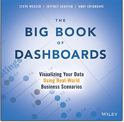
Comprising dozens of examples that address different industries and departments (healthcare, transportation, finance, human resources, marketing, customer service, sports, etc.) and different platforms (print, desktop, tablet, smartphone, and conference room display) The Big Book of Dashboards is the only book that matches great dashboards with real-world business scenarios. By organizing the book based on these scenarios and offering practical and effective visualization examples, The Big Book of Dashboards will be the trusted resource that you open when you need to build an effective business dashboard.
Pro Power BI Desktop: Self-Service Analytics and Data Visualization for the Power User
Pro Power BI Desktop shows you how to use source data to produce stunning dashboards and compelling reports that you mold into a data narrative to seize your audience’s attention. Slice and dice the data with remarkable ease and then add metrics and KPIs to project the insights that create your competitive advantage. Convert raw data into clear, accurate, and interactive information with Microsoft’s free self-service BI tool.
This book shows you how to choose from a wide range of built-in and third-party visualization types so that your message is always enhanced. You will be able to deliver those results on PCs, tablets, and smartphones, as well as share results via the cloud. The book helps you save time by preparing the underlying data correctly without needing an IT department to prepare it for you.
Hands-On Dashboard Development with QlikView
A step-by-step approach to building stunning dashboards with QlikView Key Features Perform effective storytelling through interactive dashboards built with QlikView Create different types of visualizations from a variety of data sources Includes tips, tricks, and best practices to perform effective Business Intelligence using QlikView Book DescriptionQlikView is one of the market leaders when it comes to building effective Business Intelligence solutions.
This book will show how you can leverage its power to build your own dashboards to tell your own data story. The book starts with showing you how to connect your data to QlikView and create your own QlikView application.
Dashboards for Excel
This book takes a hands-on approach to developing dashboards, from instructing users on advanced Excel techniques to addressing dashboard pitfalls common in the real world. Dashboards for Excel is your key to creating informative, actionable, and interactive dashboards and decision support systems.
Throughout the book, the reader is challenged to think about Excel and data analytics differently―that is, to think outside the cell. This book shows you how to create dashboards in Excel quickly and effectively.
What are the Types of Dashboards?
Operational Dashboards
Operational dashboards are used to show your user their current status in your app. Use operational dashboards to display critical information that’s time relevant. For example, in a web analytics application, the operational dashboard could include information like: active users on site, top social referrals and pageviews per minute.
A classic example is the Google Analytics Real-time dashboard.
Analytical Dashboards
Analytical dashboards are used to present key data sets to the user, always reflected against previous performance. They should be data-centric, and show as many relevant data views as is feasible.
Analytical dashboards should lead with key account data front and center, and should minimize graphical elements. They serve as a barometer of the user’s status in your application, and make it easier for a user to spot problems.
Strategic Dashboards
Strategic dashboards are used to indicate performance against a set of key performance indicators (KPIs). A strategic dashboard should reflect how your user is performing against their strategic goals… and not much else.
Platform dashboards
Platform dashboards are used to give a user access to controls, tools and analytics related to their account on a social platform. The YouTube Studio Dashboard is a good example. A simple initial view shows the user’s latest videos, with some stats for each.
Time-in-app dashboards
A popular new trend in mobile apps is to give the user information about how much time they’re spending in each app. If you’re working on a new social app, you’ll want to include this kind of dashboard. The idea is to help users to see if they’re spending too much time on their device.
Instagram’s Your activity dashboard is fairly typical. It’s very basic, leading with the user’s average daily time in the app, with a bar chart showing how daily time in app has changed over the last week.
Questions to ask before building a Dashboard
- Who is the audience?
- What information do they need?
- What do they already know about the metrics?
- What are their experiences with data?
- What are their prejudices in terms of visualizations and colors?
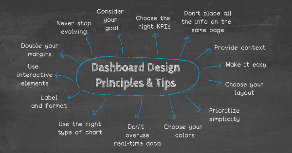
Main Dashboard design Principles
Decide what your users need from your dashboard
The first step is to know your audience. Once you’ve learned your user personas through, you should be able to answer the key question: what will my users expect from this dashboard?
Responsive dashboards hand power to the user
Adding a responsive design to a dashboard allows the user to decide which data they want to focus on. The key to a good responsive design is a clear, easily understood UI which allows the user to control exactly which data needs to be front and center in the dashboard.
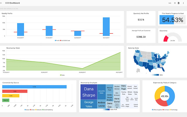
Great dashboards lead with key data
We love dashboards that cut out the bunk and lead with big, bold numbers. A dashboard like this communicates confidence and decisiveness.
Use information architecture for great dashboard design
When you design your dashboard, consider the principles of information architecture and hierarchy when you decide which cards to show and in which positions.
Remember the F and Z patterns that reflect how a user’s eye scans a page? Apply that logic to the structure and order of elements on your dashboard. Lead with the absolute top must-have takeaway, and let your dashboard flow from there.
Use different views to keep things light
We like dashboards that use different views to keep the main view as simple as possible.
Use consistent design language and color scheme
Just because dashboards often include data views, that doesn’t mean they can’t look drop dead gorgeous. By keeping things light and airy, with prudent use of color, this publisher dashboard delivers clear visibility, simple navigation and striking good looks.
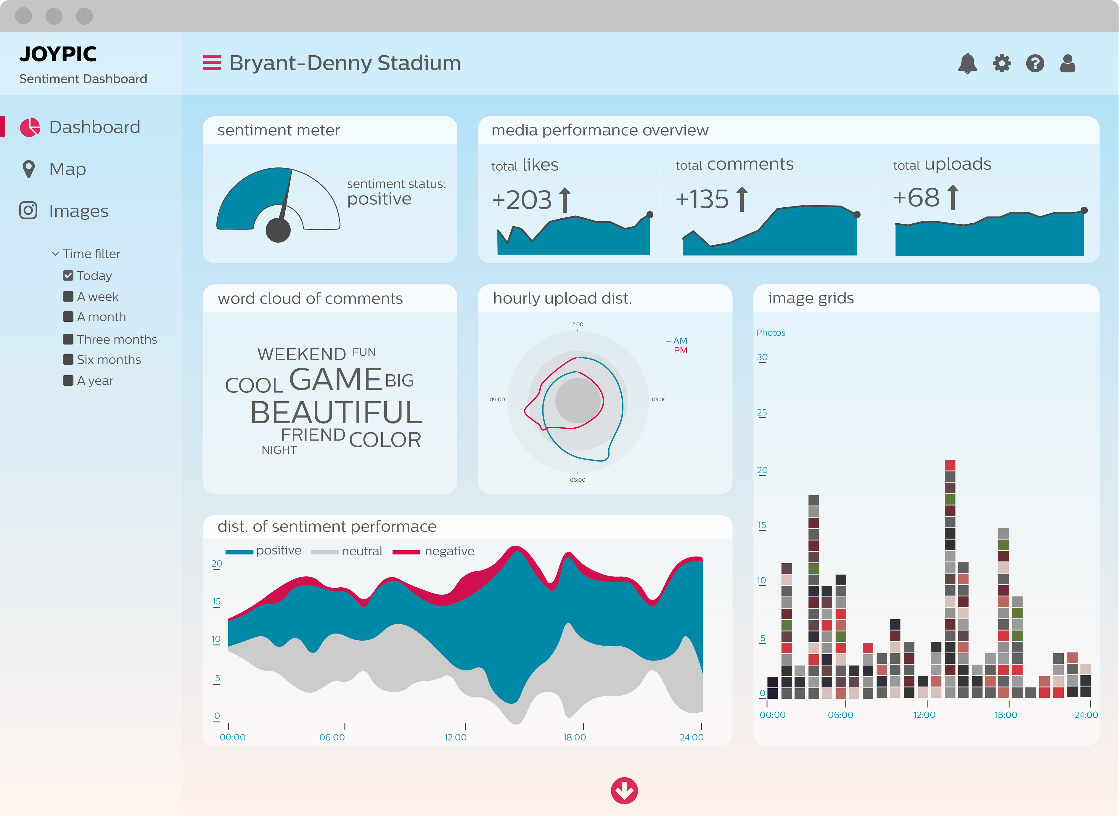
Components of a Business Dashboard
Data Sources
The fuel for business dashboards is data, so each one needs to have one or more data sources. Without data, the dashboard will not show the user anything. Data can be connected through an API, flat file, or database. Once data flows into the interface, the dashboard will come to life. A sales team might use a business dashboard to connect data from their customer relationship management system (CRM) and their website to gain insight into what products prospects are interested in.
Data Visualizations
Visualizations enable users to gain insights from data more quickly than flat files or tables. This is because visualizations summarize the aggregate data and the human brain processes images faster than lists of words and numbers. Examples include bar graphs, pie charts, and line graphs. In this way, digital visualizations are just like automobile dashboards, which use data visualizations in the form of speedometers and fuel gauges.
Filters
Many dashboards include an element of interactivity so users can explore data sets as needed. This process is often called data discovery or self-service analytics. Filters can include date ranges, data sources, geographic regions, departments, or product SKUs.
KPIs
Key performance indicators are the metrics most important to users. These are represented in dashboards either as a part of visualizations or tables. Common KPIs include revenue, cost, number of sales, profit margin, and profit. They can be segmented for more granular insight using a filter or toggle.
Navigation Menu
Most modern analytics platforms include a navigation menu to allow users to move from dashboard to dashboard. Menus make it possible to visualize many different aspects of data for different audiences and are a great fit for enterprise organizations.
Dashboard Design Best Practices
Involve Users in Each Phase of Development
Involve users in the planning phase of the business dashboard to ensure detailed requirements are collected from the internal stakeholders who use it. The dashboard will miss the mark entirely if it is developed without feedback throughout its design and development, as many assumptions can be made. This could result in many iterations of the dashboard to get it to work optimally. An agile approach with continuous feedback is the most effective way to approach each dashboard project. In the discovery phase, developers may find multiple dashboards need to be created to satisfy everyone’s need. These will then need to be prioritized in a project plan and agreed upon by each stakeholder.
Define Dashboard Objectives
The planning and design phases should be driven by concrete objectives from each stakeholder. For example, the sales department may say they want to see a high-level dashboard with the ability to drill down to specific regions and product SKUs. This type of dashboard is meant to serve sales leaders and executives, so they can see the most successful products and highest performing salespeople in each region. Company resources can then be deployed accordingly to push marketing dollars in a lagging region or to shift messaging to align with demand in a particular region.
Customize Views
Each stakeholder should have their own segmented view of a dashboard that aligns with their specific goals. For example, it would not be helpful for a financial department to look at ad copy performance data for the marketing department. These requirements will be uncovered in the planning phase. Platforms capable of including more than one dashboard are ideal because they can serve multiple audiences. MicroStrategy’s Dossiers are enterprise-grade business dashboards that can satisfy this need. One dashboard can rarely please all stakeholders, so separate customized dashboards for each stakeholder group may be ideal.
Emphasize Data in Order of Importance
In the requirements-gathering and planning phase, project managers should determine what the most important KPIs are for each stakeholder group. These should be placed to the left above the fold, as this is where a user’s gaze naturally lands.
Use Filters
By adding filters for business dashboard visualizations, users can simplify how they display data. This allows users to quickly isolate relevant insights and avoid pulling unnecessary data that can bog down performance. Filters are an important aspect of self-service data discovery that allow users to interact with datasets in visually. Filters enable users to slice and dice data to find new patterns within the business.
Ensure Accuracy
Without accurate data, a business dashboard will be useless. In fact, it can be detrimental to the business, because misguided decisions will be made. Therefore, accurate data is critical to the success of a business dashboard. Data should be checked for accuracy at each step of the implementation phase, starting with the initial design phase. First, check each data source to ensure the data is accurate before uploading it to the business dashboard. It also needs to be checked once the data is cleaned or transformed and is a best practice for any extract, transform, load process (ETL). When the dashboard is complete, the data should be checked by each stakeholder and periodically examined for accuracy throughout its lifecycle.
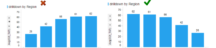
Allow Users to Drill Down
The best dashboards present users with a high-level view of the data and allow them to select data segments to drill down for further detail. For example, a sales analytics dashboard might show deals by region, and a user could drill down to see which products sold best in each region and which salespeople performed the best. It’s also important to only include the most relevant data for each view so the dashboard isn’t cluttered. This top-down approach is intuitive and should be incorporated for advanced functionality.
Choose the Best Visualizations
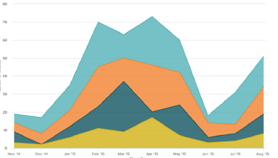
Always make sure to use the best data visualizations for each KPI. Common types include:
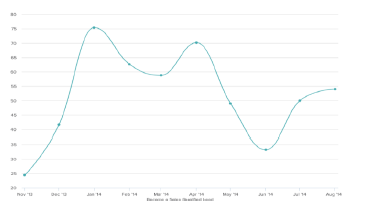
Line graphs
Bar charts
Pie charts
Tree maps
Histograms
Box plots
Heatmaps
For example, line graphs are best when the user wants to see time series analysis, and bar graphs are useful when the user wants to compare different groups of datasets against similar metrics. Always be mindful of which visualization is best to present each KPI. User acceptance testing will confirm what users prefer in each scenario.
Minimize Colorization
Businesses should recognize that dashboards using too much color can negatively affect readability. In the case of business dashboards, complex visualizations can involve more colors, but overall use of colors should be minimized as much as possible. A good rule of thumb is to use different hues of the same color for most of the dashboard, along with a one or two others to emphasize key points. This keeps the experience less jarring for users.

Dashboard design Standards & Guidelines
Focus on Usability
- Leverage look and feel of standard templates to stay consistent across all dashboard
- Stick to 80:20 rule: Build 20% of visualizations required to meet 80% of use cases. The remaining 20% can be done through self service capabilities.
- Keep report overview on home page to a minimum but informative. Use graphics to illustrate the business process
- Color should be used meaningfully leverage the standard color theme. Red/Green/Yellow should only be used for measures.
- Add the definition to description below the title.
- Add Action Controls, Slicers and Bookmarks for better usability
- Format numeric values appropriately for labels, tooltips, axis scale. Decimal places should not be more than 1pt if require else default to absolute.
- Reorder columns in “Raw Data set” so that key columns are visible first & keep it max of 20 columns
- Use a maximum of 3 panels on a page. Multiple panels should be used for a summary page but avoid using more than 4. This exclude text & KPI (key performance indicators).
- Use only 1 visualization on a page where you expect significant user interaction like data tables.
- Utilize transparent images (. png ) for Action controls icons & graphics. Utilize Standard image library.
- Give tabs / pages descriptive names
Filters | Navigations
- Don’t clog up dashboard with list boxes & filter panes. Utilize standard template
- Create “Global Filter” wherever appropriate. This is useful when you want to view the dashboard on default parameters.
- These should be placed on the “Home Page“ & can be changed from individual pages as well for flexibility
- Create page level filtering schemes to place “Local Filters for all visualizations on a page. This will not impact other pages
- Utilize the standard navigation panel to avoid culturing the tab panel when you have many pages in dashboard. This allow easy switch between pages.
- Utilize Slicers to provide users a flexibility to switch axis scales & view visualizations by different dimensions.
Visualizations
- Think of your audience. Design visualizations that respond to the business requirements and add value.
- No misleading Scale
- Turn off legend if not needed or turn off items individually, e.g.: Marking, Date Table Name, Axis Selector Names, Layer from a Map.
- Remove columns not used from table display, Details etc.
- Use Zoom bars on all charts (Y Axis) to make it easy to scale the visualization.
- Label Axis Selectors appropriately (e.g. Sum([Sales]) / Total Sales) or remove if not needed
- Try to leave one square of grid space between visualization and to the edge of the screen. Utilize standard templates to take care of this automatically.
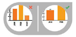
- Start the y axis at 0 to appropriately reflect the values in your graph
Visualization Design Tips
Label your charts & graphs intuitively
- On Charts that have X axis, make sure you use horizontal labels since vertical type is hard to read.
- On Line Charts, Area Charts, & Pie Charts, it’s best to label the different parts directly so that user don’t have to match color with a legend.
Call out or highlight important information
When you presenting your data visualization to an audience, make the analysis easy for them. Call our important info by using an Annotation (in contrasting color)
Utilize Consistent & attractive color schemes
- Choose Color with high Contrast to make visualization look good.
- Utilize the default color theme saved in template library to utilize it in your dashboard & customize as per need.
- For specific categories in dashboard ( eg : closure status, Win/Loss status) use same color theme. Its best to save it as a color category template & utilize it across all dashboards.
Order your data set logically
The way you order data really matters. Always sort your bar graphs in Pareto (larger value from left to right) unless it’s a time trend graph.
Apply your judgement as sometime it’s make sense to align dimension without sorting in Pareto.
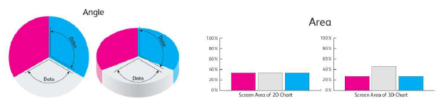
Stay away from 3D charts
As the visualization tilts, it gives user a skewed view of what data actually means. If you look at each area section takes up the screen, you will see why it’s easy to mis-interpret the 3D graphs.
Choose appropriate data ranges
Range can make the visualization really misleading if we use inconsistent ranges. Enable fairly even distribution of data and use +/- signs to extend high & low ranges.
Line Chart: Use Solid line & right height
Use the right height so the lines take up roughly 2/3 of the y axis’ height. Use Markers & solid lines for better readability.
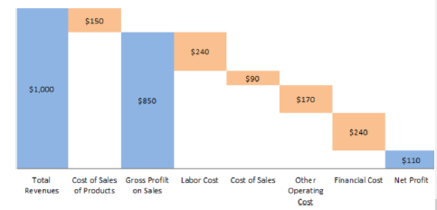
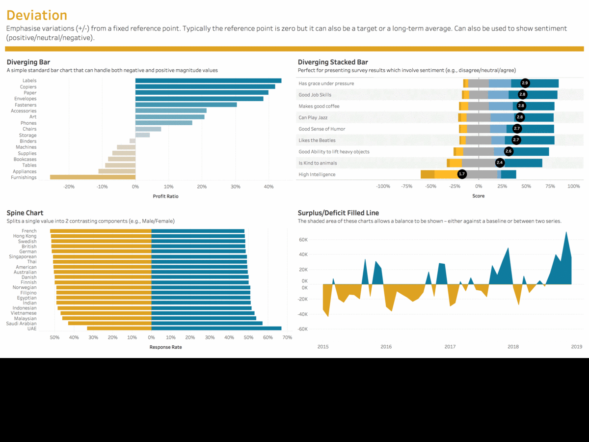
Waterfall Chart
- Use contrasting colors to highlight differences in data sets.
- Choose bright colors to indicate increases and light colors to indicate decreases
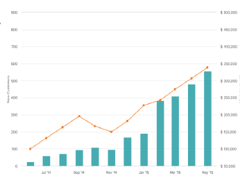
Dual Axis
- Use the y axis on the left side for the primary variable because brains are naturally inclined to look left first.
- Use different graphing styles to illustrate the two data sets, as illustrated under Waterfall Chart
- Choose contrasting colors for the two data sets.
Area Chart
- Use transparent colors so information isn’t obscured in the background.
- Don’t display more than four categories to avoid clutter.
- Organize highly variable data at the top of the chart to make it easy to read.
Choose the Right Graphs


Lets study each one separately –


Dashboard Publishing Checklist
- Dashboard is based on standard template which include custom theme, left hand swipe panel, grid/panel layout.
- Dashboard home page Contains information on report overview & target audience, Refresh schedule & last refresh timestamp.
- The name of dashboard is called out clearly with correct font size.
- The axes labels are appropriately sized with correct font and have proper units and symbols ($, %, etc.).
- The colors used in the graph are as per standard color theme.
- The title contains an informative description.
- The graphs meets the standards & guidelines as per development toolkit.
- Legend exists & formatted. By default, it should be hidden.
- The dashboard was tested on devices with the following software and hardware specifications:
OS: Windows 10
Browser: IE 11, Google Chrome, Edge
Conclusion
A well-designed dashboard is a powerful launch point for data-driven conversations. Armed with the same collection of information, your business makes faster decisions based on a single source of truth.
Dashboards need to communicate the most important information for the user, in a simple, easy to understand screen. They should be structured to reflect a logical information hierarchy, providing the user ways to drill down into the data when necessary.
Above all, they should save the user time. Thanks to latest BI Tools, creating an excellent dashboard design is easy and fun !
I truly love your website.. Great colors & theme. Did you develop this web
site yourself? Please reply back as I’m hoping to create my own personal
blog and would love to learn where you got this from
or what the theme is called. Kudos! Hi! I could
have sworn I’ve been to this web site before but after going through a few of the posts
I realized it’s new to me. Anyways, I’m certainly pleased
I discovered it and I’ll be bookmarking it and checking back often! Ahaa, its pleasant dialogue
concerning this article at this place at this weblog, I have read all that, so now me also commenting at this place.
http://marketing.com
Feel free to surf to my site: Will
I seriously love your blog.. Great colors & theme.
Did you develop this site yourself? Please reply back as I’m
wanting to create my own site and would like to learn where you got this from or exactly what the theme is named.
Many thanks! I simply couldn’t depart your site before suggesting that I really loved the usual information an individual provide in your visitors?
Is going to be back ceaselessly to inspect new posts I could not resist commenting.
Very well written! http://newground.com
Check out my website: John
Really informative blog.Thanks Again. Much obliged.
WOW just what I was searching for. Came here by
searching for web hosting company
Heya i am for the first time here. I found this board and I find It truly useful & it helped me out a
lot. I hope to give something back and help others like you aided me.
I need to learn more insight from you! And I intend to link back to this |post straight away. Thanks!
I think other site proprietors should take this web site as an model, very clean and magnificent user genial style and design, let alone the content. You are an expert in this topic!