
Google Data Studio is Google’s reporting solution which gives you everything you need to turn your data into informational, easy-to-understand reports through visualization. GDS is part of Google’s Marketing Platform, a collection of products for advertising and analytics, providing a powerful tool for turning data into dashboards and reports. Previously seen as an intimidating enterprise-class solution, it’s a new interface, with flexible connectors and some great free learning resources makes it accessible for everyone.
Data Studio can essentially visualize any data you’re already accustomed to gathering in GA and other data sources. For example, you can easily see traffic data from any date range, including page views, users, sessions, and geographies as well as the age and gender of users and traffic patterns for different times of the day, month, and year.
Lets get started with knowing more about this awesome tool !
To know more on Business Intelligence Click here.
To get a complete Dashboard Development guide click here.
Table of Contents
Importance of BI
Why Data Visualization is important ?
- Helping clients understand how their site’s data is being analyzed to determine business decisions.
- Reporting large amounts of data in a visual format to present an overview, or story behind it all.
- Visualizing data in order to convert trends into strategy.
- Finding errors in a more obvious way, eliminating room for gaps of information.
What is Google Data Studio ?
Google Data Studio is a visualization and reporting tool, and an integral part of Google Marketing Platform. It enables an enhanced approach to decision-making, allowing your entire organization to readily access and use marketing insights, like the ones provided by USA SEO services.
Data Studio lets you create beautiful, informative reports that are customizable and easy to understand and share. Empowered with the information they need, your teams can make better decisions at the exact moment they need to. With Data Studio, you can build reports and dashboards with just a few clicks.
Thanks to Google Data Studio, we can now communicate and act on the customized data. Developers, execs, and global team members from multiple departments can compare, filter and organize the exact data they need on the fly, in one report.
Benefits of Google Data Studio
While Google Analytics, for example, is primarily aimed at experienced users, Google Data Studio is much more user-friendly and intuitive, allowing even novices to quickly get to grips with it. What’s more, Data Studio’s extensive features and configuration options make it possible to create custom reports as well as personalized and interactive dashboards.
The major advantage of the tool is that data from the connected sources can be visualized quickly and clearly. As a result, professional reports can be created in next to no time, even without in-depth expert knowledge. Google Data Studio is also browser-based, so you don’t have to install a local application.
- Free to use.
- Connect to (almost) any data source. (Think Google, Bing, Facebook, LinkedIn, etc.)
- Fully customizable – the ability to change reports for each clients’ needs.
- Consistent and on-brand.
- Full control over customization of reports and visuals, including adding as many pages or charts as needed
- Real-time data integration.
- Advanced formulas such as calculated metrics and calculated fields
- Saves time each month pulling reports – meaning you get to focus on actionable insights.
It’s FREE!
A frequently asked question to those who are unfamiliar with this tool is “Does Google Data Studio cost money”? The answer to that is no! Google Data Studio is a FREE tool that is available for anyone to use.
Customizable Report Dashboards
Google Data Studio allows users to create custom reports with a wide range of designs, styles, graphs, and formatting. If you’re new to Data Studio, then there are plenty of pre-templated reports to choose from. Otherwise, you can start from scratch and create one entirely unique to your reporting style.
Modern & Interactive Data Visualizations
With Google Data Studio you don’t need the skills of a graphic designer to create modern-looking reports! With a few clicks, you can easily create an engaging and visually appealing dashboard that is sure to “wow” your audience.
Automated Reports with Real-Time Data
Manually exporting data and formatting reports can become very time-consuming. What if you could automate all those routine reports to spend less time building them, and more time on actionable insights?
Google Data Studio allows you to build fully automated reporting dashboards with real-time data, which saves you countless hours on reporting.

Shareable Dashboards
Google Data Studio has report sharing and collaboration features that can help streamline communication among your peers and business partners. You can choose between viewer or editor access and share your reports via the following:
- Link sharing
- Email permissions
- Scheduled email deliveries
Google Data Studio Exports
After you finish creating your report dashboard, you then have the ability to export it to the following documents:
- Excel
- Google Sheets
Most individuals have their own preference when it comes to reporting, so this can be especially helpful for those who prefer Excel documents to dashboards. Additionally, you can schedule automated email exports that will send a PDF version of the report to a number of individuals, like managers, direct reports, and even clients!
Drill Down Capabilities
As all digital marketers know, when it comes to reporting there are many different levels at which we can measure and view performance. Google Data Studio enables you to drill down into your data all within a single chart or element.
Connection to Multiple Data Sources
A healthy marketing mix contains various strategies and tools leveraged to reach your audiences. Google Data Studio allows you to connect to multiple data sources (Google Ads, Google Analytics, Google Search Console, Sheets, etc.) all within a single dashboard.
Whether you’re reporting on social media, search engine optimization, or Google Ads, you can easily do so by connecting multiple data sources to your Google Data Studio dashboard.
Filter Tools
Filters in Google Data Studio will allow you to refine your data based on any dimension or metric. Some of the most common filters include:
- Date range
- Account
- Campaign
- Location
There are multiple ways to apply report filters. They can be done at the report level, page level, or chart level. Filters can also include conditions such as and/or to further refine your data.
Calculated Fields
To put it simply, calculated fields in Google Data Studio are very similar to the formulas that would be used in an Excel spreadsheet such as:
- Basic math (add, subtract, multiply, divide)
- Functions (more complex equations and statistical operations)
- CASE statements (if/then/else logic)
For example, if you are trying to calculate your cost-per-conversion, but you don’t already have that metric imported, you can create your own calculated field within Data Studio.
Why you should use Google Data Studio?
As mentioned previously, Google Data Studio can bring together your reporting across multiple platforms and tie all your data together in one place. There are many other reporting services out there that can do similar things but none that are as comprehensive and clean as Google Data Studio (plus, its Google so naturally all their products seem to mesh well together).
Think of Google Data Studio as being able to provide comprehensive data reports that are living, breathing, real-time documents for everything from a monthly executive report to a day-to-day campaign reporting tool that can be utilized by not only internal employees but also clients. With Google Data Studio in your arsenal, you will be able to have a cost-effective (it’s free after all) solution for all your reporting needs across your organization/clients.

Drawbacks of Google Data Studio
Data Studio’s analysis chops are not on par with the top business intelligence (BI) tools currently in the market (Tableau, Power BI to name a few). While it effectively visualizes your data, it doesn’t allow you to slice and dice and analyze your data in nearly as many ways as those tools do.
Some key setbacks for data scientists is that data studio can only do 1 type of join/blend (outer left) and when using blended data to create calculated fields it really feel more like art than science, and not always working out. There is also no way to create unions across all data sources or make a file directory a data source. All this means that you really need to do a lot of data prep in Google sheets and find a way to do some automatic data blending in Google sheets as well in some cases. This will keep the complexity of your needs in Data Studio minimal, which seems to work best.
Since Data Studio has so many in-depth reporting features, the software itself can be confusing to adapt to and the learning curve for reporting is quite steep if you have no prior experience. It took our team a long time to learn and adapt the software and collaboration on one report was often difficult, which resulted in one member being delegated to handle reporting responsibilities. It would be nice if the Data Studio was able to incorporate task management and campaign tracking alongside its powerful reporting abilities; I think that would really push Data Studio above the competition from software such as Domo and Tableau.
How much does it cost?
At the moment, Google Data Studio is offered completely free by Google as part of its Google Cloud Platform offering. Any additional cost comes when using third party connectors to pull in data from platforms not owned by Google such as Salesforce, Facebook, Mailchimp etc. These costs can start from as little as $39 per month depending on the type of connector used.
Is Google Data Studio GDPR Compliant ?
In response to the enactment of the General Data Protection Regulation, Google has adapted many aspects of the data protection measures for its Data Studio. Consequently, you not only have to agree to the data privacy policies and terms and conditions, but you also have to mention the use of Google Data Studio in your company’s own privacy policy.
How to use Google Data Studio ?
- Log in to Data Studio at datastudio.google.com
- Familiarize yourself with the dashboard
- Connect your first data source
- Create your first report
- Add some charts
- Customize the formatting and add a title and captions
- Share the report
Introductory Courses on Google Data Studio
The Introduction to Data Studio online course teaches marketers, business owners, agencies, and data analysts how to visualize data online to gain insights. You’ll learn how to connect your data, create impactful reports, and collaborate with teammates. You’ll gain the knowledge and tools you need to design compelling reports to share with different stakeholders.
https://analytics.google.com/analytics/academy/course/10
Advanced Course on Google Data Studio
My This Udemy Course on Google Data Studio covers all topics from basic to advanced and can suffice as a complete guide to master Google Data Studio. Here is the link :
This Google Data Studio course will help you to become a Data Visualization Expert and will enhance your skills by offering you comprehensive knowledge, and the required hands-on experience on this widely used Cloud based BI tool, by solving real-time industry-based projects.
More than 20 thousands have enrolled and benefitted from this course, giving hundreds of 5 star reviews.
Top Reasons why you should choose this Course :
- This course is designed keeping in mind the students from all backgrounds – hence we cover everything from basics, and gradually progress towards advanced topics.
- This course can be completed over a Weekend.
- Actual Case Studies and Live Examples of all topics.
- All Doubts will be answered.
Below are the course contents of this complete and concise course on Google Data studio:
Introduction – In this section, the structure and the contents of the course are discussed. We also discuss the reason to why should we learn Google Data Studio.
Theoretical concepts – This lecture covers the prerequisite understanding of key terminologies and concepts before we start to work on Google Data Studio.
All charts and tables in Data Studio – We cover all the available chart types one-by-one. It includes Data tables, scorecards, bar charts, time series, pie charts, GeoMaps, pivot tables and many more.
Data filter controls – This lecture covers the filtering options that can be given to the report viewers so that each viewer can filter the data and see only what s/he wants to see.
Branding the report – Branding a report is a very popular business practice and we will see how we can do it using brand logo and brand colors
Embedding external content – We can add videos, quizzes, feedback forms, company websites to our report. Yes! It is possible. We will see how in this section.
Blending multiple data sets – Real life data is in multiple tables. To plot a graph using data from multiple tables requires data blending. Very Important Section.
Report Sharing and Collaborating – This section covers ways in which you can give viewing or editing rights to others. You can also schedule regular reports to the management using Google Data Studio. Report sharing is something where no other Data Visualization tool can beat Google Data Studio.
And so much more!
By the end of this course, your confidence in using Google data studio will soar. You’ll have a thorough understanding of how to use Data Studio for creating insightful dashboards and beautiful reports.
Most Importantly, Guidance is offered beyond the Tool – You will not only learn the Software, but important Dashboard Design principles. Also, I will share a cheat sheet to quickly find the right chart to use, sources to get public datasets to work on, Getting inspirational ideas, How to make money by using your Google Data Studio Expertise, and even about a Free Google Certification you can obtain.
A Verifiable Certificate of Completion is presented to all students who undertake this Google Data Studio course.
Check out this promo video :
Google Analytics vs Google Data Studio
As Google Analytics has evolved over the years, new features have been introduced to help visualize the immense amount of data collected about websites’ users, their behavior on a website, and how they found the website. Custom reports and dashboards have made it easy to add simple chart elements with tables of data to help summarize or focus your analysis.
Data Studio is not part of the Google Analytics evolution. Data Studio is not the next level of visualization with the newest types of charts. Rather, Data Studio is a completely separate product more closely related to Google Sheets and Google Docs. That it visualizes Google Analytics data really well is why we’re particularly interested in it, but let’s set the stage appropriately.
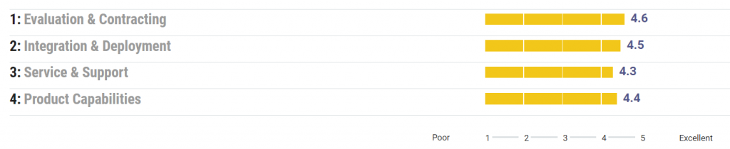
Google Data Studio Gartner Ratings
Overall Rating as checked in Gartner is 4.5/5 for Google Data Studio.
Google Data Studio Reviews
I love how easy it is to put the data points into different graphs and visualizations. The UI is typical of Google. Super intuitive and user-friendly and most aspects of the product behave exactly as a user would expect (which isn’t the case in my experience for softwares like Tableau). Ease of use is by far what makes Google Data Studio stand out among the crowd.
Mallory from Lucid Software
It seems that every third party SaaS that collects data online has native synchronization support for Google sheets. And this is how Google Data Studio makes itself the best option for non profits and small businesses in need of automated business intelligence. On top of the plug’n’play integration experience, data studio has a unique approach to interactive chart and dashboard design that lets you position elements as if you were working in Adobe Photoshop. You can add shapes, layer elements on top of each other, add text or objects anywhere. This means you can produce the most beautiful and intuitive dashboards and reports ever (or the least if you’re more of a Picasso).
Virgil from Save the Children Hong Kong
Pros : The dashboards are more user-friendly and appealing than many of the other competitors out there. This can be important when trying to win over less tech savvy business colleagues who want a more colourful and easy to use view. Especially if all they require is a scheduled email containing a PDF.
Cons : Occasionally a certain tweak to a dashboard isn’t possible, e.g. customising a bar graph’s labels so they show the percentages rather than the absolute values. In this example you have to choose a less-preferred pie chart instead.
Steve from Cheil UK
Overall, my experience with Data Studio has been mixed. The learning curve is definitely steep and it is not the easiest tool in terms of collaboration compared to other options on the market. Importing data can often be a pain and it is sometimes quite difficult to set up connections to refresh data sources, which makes reporting more manual and time-consuming than it should be.
Andrew from Amazon
Google Data Studio Setup
Create Account
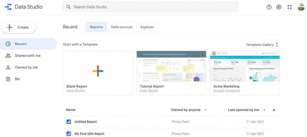
To create an account, go to https://datastudio.google.com/ and click “Use it for free.” Data Studio will use your Google Account to sign in.

You’re presented with the following screen once you’ve signed up or logged in :
Connecting to Data Sources
The first thing you need to do to start building a report is connecting data. A data source, or a connector, as Google calls it, is the building block of a Data Studio dashboard.
Data Studio already has built-in connections to over 300+ data sources (full list of data sources linked here) eliminating the need to schedule periodic data refreshes for your reports.
Having a live data source also means you’re not limited in terms of what date range you can look at. Depending on how far back your data goes, you can use any date range that satisfies your needs.
There are two types of data connectors for Google Data Studio:
- Google Connectors – These are ready made connectors with free access to other data in the Google suite.
- Partner Connectors – Developed and sold by third-party companies, partner connectors enable you to connect to data not found in the Google suite.

Google connectors can import your data from Google Analytics, Google Ads, Search Console, YouTube, Sheets, and more.
In addition to the standard Google Product suite, Google has added some other native connectors for third party data sources such as SQL, MSQL, Big Query, and CSV upload connectors.
Google Data Studio Interface
Create Report by clicking on ‘Create’ and selecting Report from dropdown. You will be presented with the below screen after you connect your data :
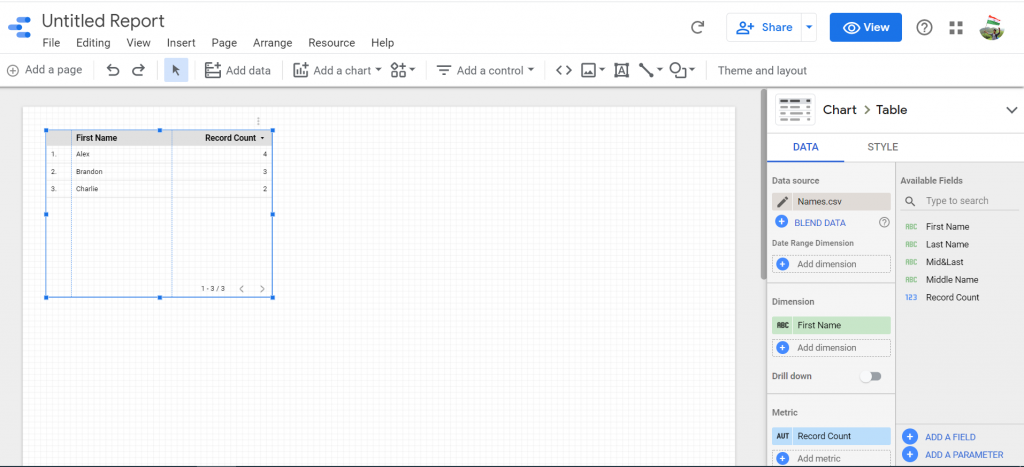
On the middle of the screen is a grid. This is your report. It’s where you’ll drop in charts, tables, images, and other design elements we’ll discuss later.
On the right sidebar is the “Editor.”
When you have nothing selected in the main grid, it lets you edit the theme and layout of the page.
When you’ve selected a chart, the right bar is where you’ll play with the data, including adding dimensions and metrics, filters, calculated fields, and where you’ll style the individual chart.
Data Blending
Data Studio allows data blending, which gives you access to create reports from more than one data source.
Data blending can help in revealing relationships and trends between different data sets. Since everything happens within Data Studio, you now have the opportunity to present new findings as well as save time and effort on data manipulation.
Conditional Formatting
Conditional formatting allows you to coordinate your data with certain colors and fonts as well as create clarity within your data using visualizations to illustrate your findings.
One feature of conditional formatting is single color conditional formatting. This applies a specific font color and background color to your data. Conditional formatting can be applied to any row, field, or any specific dimension or metric within your chart. However, there are certain rules and limitations that need to be taken into consideration when formatting.
Filters
Filter properties are a great way to reduce the data shown to report viewers. Filters let you focus on the data that best communicate the story you want to tell, adding relevancy to the reports you’re presenting to your audience.
You can apply a filter to a chart, control, page, or the entire report using the DATA properties tab.
Data Studio offers two types of filters:
- Include filters retrieve only the records that match the conditions.
- Exclude filters retrieve only the records that DON’T match the conditions.
Chart Controls
Drop-down list
A drop-down list lets you select a control field dimension that’s found on one of your charts. Users can then select which instances of that dimension they want to keep in the view. For example, imagine a chart displaying all the top pages alongside data like “New users,” “Session length,” and “Pageviews”. Using a drop-down list, you can let users select which pages (the dimension, in this case) they want to keep looking at.
Fixed-size list
A fixed-size list is identical to a drop-down list except that it already appears open. It saves the audience a click and encourages them to start altering the data view.
Input box
The purpose of the input box is to let users type in the value they want instead of selecting it from a list. However, like the drop-down, you can only select one dimension. Let’s keep going with our page dimension. If you choose pages, the audience can type in a value they want to look at. They may have a specific page in mind they want to see in the chart.
Slider
We’ve already encountered the slider at the chart level, but there’s also a control slider. This one operates much the same. By selecting the metric you want the audience to control, they can establish a range or limit they want to see. The slider will affect any chart that contains the metric you’ve chosen.
Checkbox
The checkbox is the most niche control on the list, only usable for boolean values. In other words, you could let the audience select all the true values or all the false values, and filter the charts containing the boolean accordingly.
Calculated Fields
Calculated fields can be created to display custom calculations based on the available data. While your data will already provide a lot of helpful fields that can effectively represent your data, calculated fields give you the option to further customize and create more tailored functions.
Using calculated fields, you can display totals, averages, specific dates and geographic data in addition to basic arithmetic functions. The Data Studio Help site offers a great explanation of calculated fields.
To create a calculated field, go to “add dimension” and click “create field.” Remember to name it something specific so it can be easily identified later.
A calculated field is a formula that completes a numerical action on the chosen fields in your data source. Calculated fields are important because they can change the text, date, and geographic information, to conclude different results within your data.
Themes
With Data Studio being completely customizable, creating a report that fits your client’s needs is simple. To make things even better, Data Studio gives you the option to upload your site in order to capture a theme that fits.
Dimensions and Metrics
To cover the basics, Metrics are measurements, and Dimensions are what you’re measuring. Data Studio makes it even simpler to distinguish metrics vs. dimensions by coloring the metrics blue, and the dimensions green. Data Studio also offers drill-down options.
A dimension in Data Studio is usually text, geographic coordinates, a Boolean choice, a date or time, or a URL. A metric can be a number, a percentage, a duration, or an amount of currency.
Charts in Google Data Studio
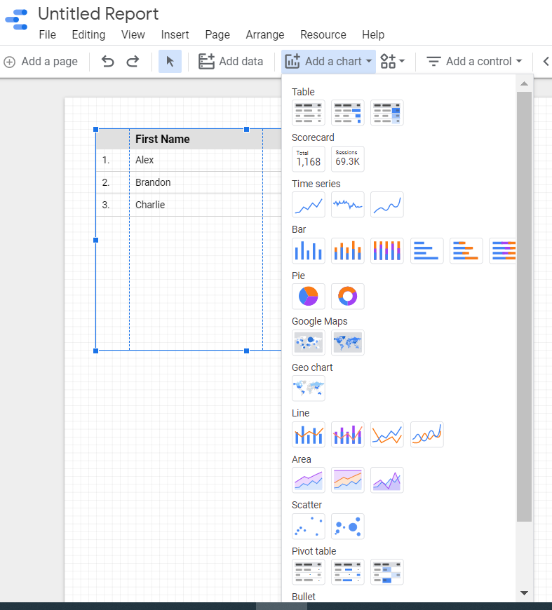
Data Studio offers a variety of visualizations, including charts, graphs, and table options along with features that help customize and interpret your data based on your business goals and objectives.
Google offers 13 types of charts, with a few variations to each. They are:
- Tables
- Scorecards
- Time Series
- Bar Charts
- Pie Charts
- Google Maps
- Geo Chart
- Line Charts
- Area Charts
- Scatter Plots
- Pivot Tables
- Bullet Chart
- Treemap
Bullet Charts
Bullet charts were developed and designed by Stephen Few1. The idea spiraled from gauges and meters in which the main focus is to show the relationship between performance and target. Bullet charts provide qualitative ranges of performance on a quantitative scale. Bullet charts are very helpful when you have a target number and a goal to increase user satisfaction and company efficiency.
Scatterplots
When you have this perfect correlation in mind and can’t put into words, put it in scatterplots, because that’s what they are for! One way you can benefit from this chart type is with eCommerce product performance analysis. Finding the correlation between product view and checkouts on your site can give you a lot of insights such as whether users are visiting your site for some window shopping, or completing a checkout.
The conclusion from scatterplots will be specific to your site. If most of the content on your site is more than a “three to five minute read” and your scatterplot shows around two min average engagement time, this could be a sign for some improvement or changes on the content-heavy pages.
Treemaps
Treemaps are visual representations of a data tree that displays nested categories. The reason it contains the word tree is because of the similarity to the hierarchical order of a tree, branches, and leaves. Each rectangle represents nodes, a central or connecting point at which pathways branch. Each branch can have sub-branches, and one parent branch. These rectangles are sized and colored according to their values. By default, the darker to lighter represents high to low value.
Treemaps work best with a large amount of data and when you want to visualize a part-to-whole ratio. Looking at a bigger picture can help you see where you stand with your business goals and make decisions on what to improve.
Geo Charts
Google Maps differs from Geo Charts in regards to the detail on the map. With Google Maps, the map looks similar to the actual Google Maps product, allowing you to zoom in and see county lines and roads. The Geo Chart uses a more straightforward map that can’t be zoomed. It’s best for general data.
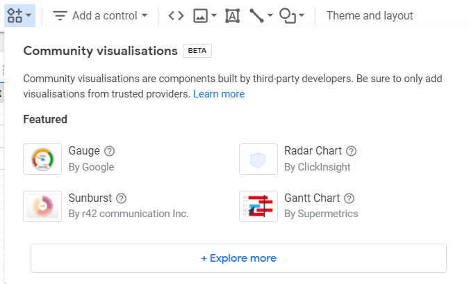
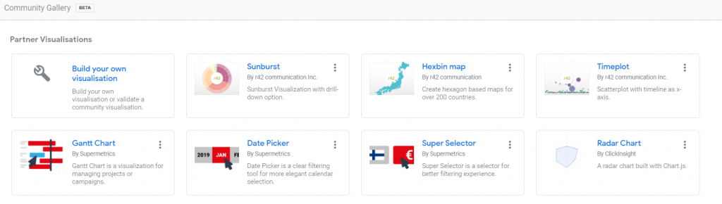
Community Visualizations
One additional resource at your disposal is community visualizations. These are charts Data Studio users have made that are a little more creative than the 13 Google’s already added to the platform. Community Visualizations are in Beta right now, and you’ll only find a handful of new charts. However, there are some handy visualizations like a funnel, gantt chart, and venn diagram. If you’re feeling creative, you can even make your own.
Sharing Google Data Studio Reports
Google Data Studio is designed to have optimal collaboration capabilities. Similar to a Google Doc, you can easily share your report with others by just sending them a link.
You can also control how each user can interact with the document by assigning viewing and editing parameters. This gives you the ability to easily share and collaborate with clients and teammates without having to share password information that would give them complete access to your Google Analytics account. This way, they will see only the information you choose to share with them on Google Data Studio.
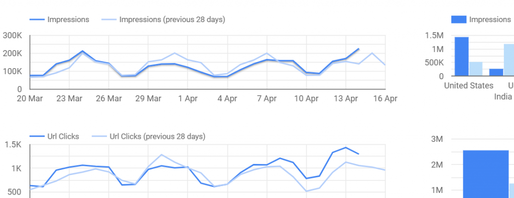
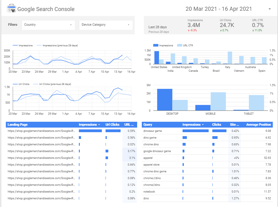
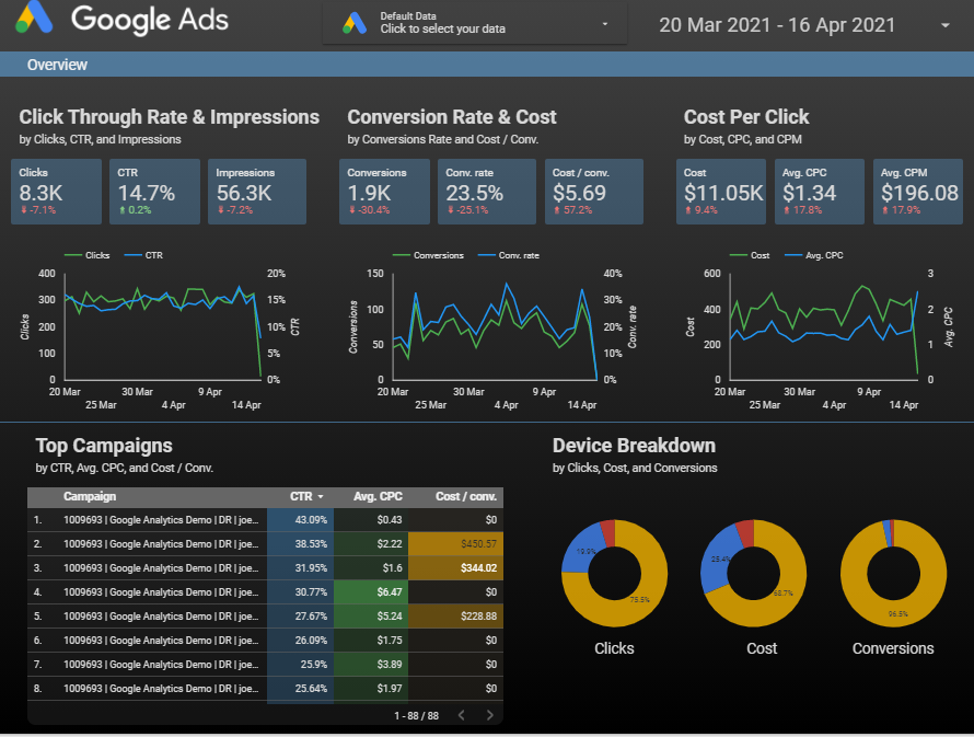
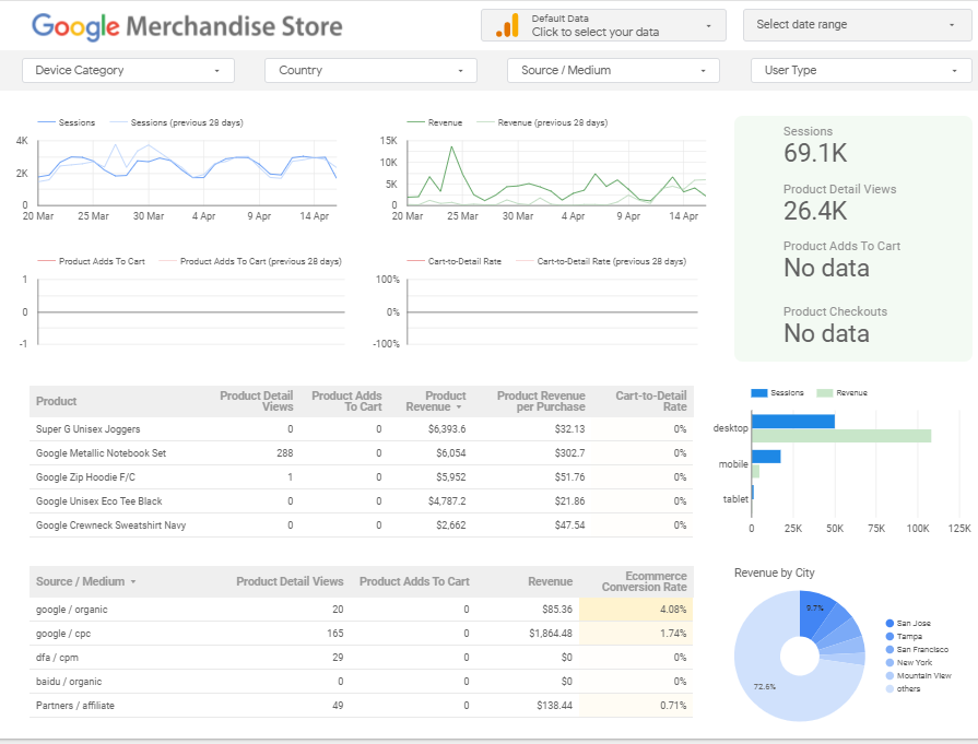
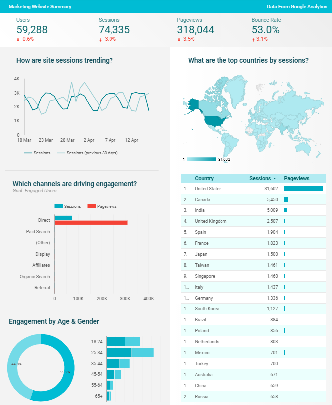
Google Data Studio Report Examples
Google Data Studio Alternatives
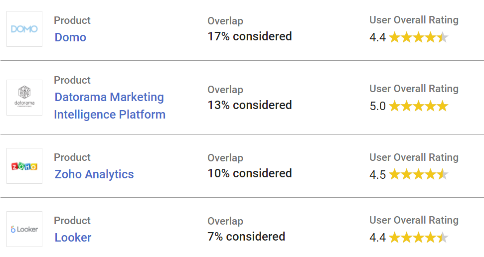
Considering alternatives to Data Studio? See what Marketing Dashboards Data Studio users also considered in their purchasing decision. When evaluating different solutions, potential buyers compare competencies in categories such as evaluation and contracting, integration and deployment, service and support, and specific product capabilities.
Alternatives to Data Studio are Domo, Zoho Analytics, Datorama, Looker etc.
Learn Tibco Spotfire. One of the best BI tools used Industry wide that is also a part of Gartner’s Magic Quadrant ! Click here for a complete course at the Cheapest price !
Conclusion
Overall, Google Data Studio is a very powerful reporting tool that has native integrations into almost all of Google’s products that they offer. It also has the ability to connect to additional 3rd party data sources such as Facebook, SEMRush, Moz, Twitter, Instagram and more through 3rd party connectors. For a free product, this is hands down one of the greatest reporting tools that you can use for your company to report on a client’s digital analytics.
Google Data Studio is truly a groundbreaking tool for digital marketers. There is nothing else that parallels this tool on the market today. Google is leading its industry by providing fully customizable, visually appealing reports that can be tailored to fit your needs. This program is streamlined to update in real-time, easy-to-use, and easy for your clients, teams, and colleagues to understand. Stop laboring over excel spreadsheets and manual diagrams, and start creating professional reports using Google Data Studio.
Do check out my Course and enroll if you really want to learn all the nuances of Google Data Studio !